Friday, January 27, 2012

Kraftin' Kimmie in the Spotlight!

I finally got a chance to play along with a Kraftin' Kimmie challenge, #112, "In the Spotlight". I have never done the spotlight technique though I've done something similar where I match up layers of patterned paper, so I figured that I might as well go for it. Since I was doing challenges, I also used Splitcoast's Sketch Challenge #369.


I was inspired by my very sweet and talented friend, Cheryl, who recently colored a very effective and striking monochromatic grayscale card.

In fact, Charlotte, a Kraftin' Kimmie Annie Rodrigue stamped image, was sent to me as a gift by Cheryl, when I asked her to stamp a few images of Drucilla, who is stabbing a voodoo doll and send 'em to me. I *needed* this image for a special circumstance. Sadly, the voodoo did not work, but maybe one day "Karma" will. Anyway, I guess she didn't want the voodoo girl to be alone on her airplane trip, so she sent along a few other stamped images. Cheryl is soooo nice and considerate.

One day I hope to get some KK stamps, but that'll have to wait for a bit until I'm gainfully employed. Or get some money. Or both.

Anyways, I used the Toner Gray Copic markers for the majority of the image, then matched the colors from the Ooh La La 6x6 pad by My Mind's Eye. The sketch was a fun one to do since it involved a whole lot of layering of patterned papers, which is always fun for me!

Thanks for visiting today!

I will be entering this card in the following challenges:
Kraftin' Kimmie Stamps "Challenge #112--In the Spotlight.
Splitcoast Stampers Sketch Challenge #369
Outlawz Copic/Promarker Fridays "Anything Goes" Challenge
Simon Says Stamp Challenge "Anything Goes"

Thursday, January 26, 2012

Do Over!

Whereas I was really quite happy with the way that the porcelain roses came out (see post below), I was not happy with the way the two Bombshell ladies (Rose & Señora Muerta) looked on the earring holder/frame. So, I pulled them off the frame, set them aside for a rainy day, and added two more ornate flourishes to either side of the frame. I'm currently contemplating adding other elements to it. But, I also changed it up by adding more foam tape to the reverse of the frame so that earrings will really hang smoothly. So, I'll re-photograph the earring frame when I'm happy with it.

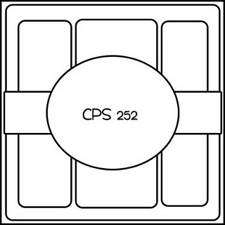
Well today was, in fact, rainy, so I got out Card Positioning System's Sketch #252 and had at it.

Here's the sketch:


Here's my take on it (that I flipped to work with the image):


The card features Rose from Bombshell Stamps' Rose's Portrait set (also carried by Simon Says Stamp's store), which was colored with Copic markers. I used a new-to-me color combo (E40 + R0000) on her skin and am quite happy with it. The patterned papers are by My Mind's Eye and are from the Lost & Found, Madison Avenue 6x6 pad. I used Distress Ink (limited edition red) to edge all the layers. Retrospectively, I wish I hadn't used the corner rounder on all the corners, like the sketch. Oh well. This time, done really is done and there will be no do-overs. :D

Thanks for visiting today.

I shall enter this card in the following challenges:
Card Positioning System #252
Outlawz Copic/Pro-Marker Friday "Girls Only" challenge
Simon Says Stamp Challenge "Anything Goes"

Wednesday, January 25, 2012

Bombshell Stamps Hump Day Hop!

She said,
Make anything you want, as long as there is something "new" for you in it. Never made jewelry before? Give it a go! Never attempted a tri-fold card? Now is the perfect time! Perhaps you've never used pink with your Bombshells....why not experiment? Wow us with your experimentation!


I took Alison's challenge and finally liberated my Melting Pot from its infernal plastic cocoon. The plan was to make UTEE porcelain roses and some shrink plastic earrings.

My first attempt on the roses was an epic fail.

My first attempt with the shrink plastic was a fail too, though not epic. Who knew that stamped StazOn ink would run in the UTEE? Not me. However, I did end up with some curious looking "tiles" and had fun watching the shrink plastic writhe in the hot UTEE.

So, due to the above and my usual tendency towards procrastination, my project will be late...

Well, here it is with a gazillion photos, that were taken with the flash because it was dark out. *sigh*

Here it is!


Close-up of "Porcelain Roses", which are red, purple, and kraft (note the ladybug charm on the leaf):


Close-up of Rose & Señora Muerta:


Close-up of Rose Quote on Shrink Plastic:


Close-up of earrings:

Alison, our lovely Hump Day Hop Hostess, challenged us to "Try Something New!".

Close-up of Frame with earrings:


Close-up of "rejects", though I think they're sort of cool.


Here's the short version of what I did. Hah.
1) Punched six-petal flowers, cut 'em, shaped 'em, sprayed them with Ranger's Gold misty stuff, and then dipped them into a nice hot relaxing bath of UTEE in the Melting Pot. It took awhile to get three that I would show in public. I also punched a mess of flowers from green cardstock and they took a UTEE bath too. Note to self: stuff gets darker in UTEE!

2) Stamped Rose from Rose's Portrait set and Señora Muerta from the Mi Amor set. I had several frustrating Copic coloring problems, but then got two that didn't make me want to puke.

3) Stamped the guns and the skeleton from the Retro Cowgirl set onto shrink plastic, die cut them, and colored them with Copics. I stamped the flames from the Hearts on Fire set with red, orange, and yellow StazOn. Then I tossed 'em into the melting pot, which was a failure, but was fun and yielded some interesting results that I think are somewhat cool.

4) Stamped everything all over again onto the shrink plastic (clear and white), die cut them, and heat set them with my heat gun. This time it sort of worked, so I added earrings and jump rings (need to get larger circular ones) to swap out. Oh. I also stamped the rose quote from Rose's Portrait set and heat set that to shrink it because why the heck not? Yeah. I also realized that having the guns pointing up (bang to the head) was not a great idea, so I found a bit of clear shrink plastic left, restamped the guns, then used alcohol ink on the reverse of them, then shrunk 'em. :D

5) Sponged three colors of Distress Ink onto Ideology's Kraft Resist paper, spritzed it with Gold Ranger misty stuff, then adhered it to a frame from the dollar store.

6) Cut down some screen and added it to the aperture and added some foam tape to the back to give some room for earrings to be hung from the mesh with care, in the hope that Santa would soon be there. Nope. :D

7) Glued all sorts of stuff to the frame.

8) Took photos and then bored you all spitless!

P.S. I took a look at this online and decided I didn't like the two Bombshells on it, so I've taken them off and will use them on other projects. :D

Thanks for coming back to see this!

Here's the Hop List!
Bombshell Blog
Alison
Laura
Alaine
Sparkly Mary
Meredith
Cheryl
Paula
Kelli
Stempelientje
Glittery Katie

Sunday, January 22, 2012

Aloha!

You can breathe a sigh of relief. I'm taking a little break from bad gnome pun cards for a bit.

I wanted to dispel the snowy cold late January gloom with a warm and tropical card. So I grabbed my new Graphic 45 Tropical Travelogue 8x8 pad and Bombshell's Hula Girl and set about creating a card based upon a sketch by Simon Says Stamps Challenge.

Did you know that Simon Says Stamp's store carries Bombshell Stamps? They do. Sadly, they don't seem to carry the Hula Girl set. I'm a dweeb and didn't check until the stamped panel was all done. So, I figure I'll just make a second card using one of the sets they do have. I even know which papers I'll use.

Here's the sketch:


Here's my card:


Here's a close-up of the sentiment:


Here are the (long-winded) details. Hula Girl was colored with Copic markers, then masked with Windsor & Newton masking fluid. When the fluid was dry, I adhered a strip of removable Scotch tape to create the the division betwixt sea and sand. The "sea" was airbrushed over the torn edge of scrap cardstock with BG11, BG13 and B16. Then I flipped the tape, covered the "sea", grabbed the other torn edge, and airbrushed E41, 42, and 43 to create the beach. When I was done, I peeled off the mask and used a white Inkssentials Gel pen to add white caps and foam to the sea.

The sketch called for all sorts of different embellishments, so I pulled out my very ancient Prima flowers, some old ribbon, and some equally old buttons. I usually agonize over placement of embellishments, get frustrated, and end up leaving 'em out, so it this sketch was major fun for me.

Since my motto is "A Project just don't sing if it ain't got the bling!", I added gemstone flowers to the Primas and used glitter stickers for the sentiment. I should note that I used my Copics to color the white glitter stickers. Gotta love that I can get all matchy-matchy with things.

Thanks for visiting my blog today!

I shall enter this card in the following challenges:
Simon Says Stamp Sketch by Domi Challenge
Outlawz Promarker/Copic Friday Challenges: Girls Only!
Let's Ink It Up: Challenge #19 -- Anything Goes!
Addicted to Stamps "Summer in Winter" Challenge
Craft A Scene Challenge #1 -- Anything Goes

Saturday, January 21, 2012

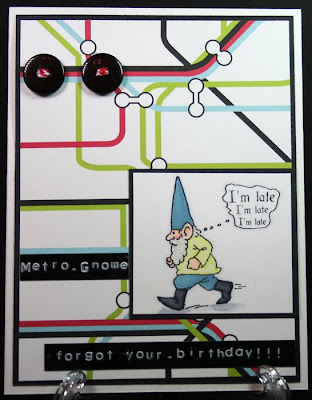
Metro-Gnome (train version) is back!

Yes. The train version of Metro-Gnome is back!!! There is a musical metrognome version too and that will likely make a reappearance one day.

Anyway, this is the perfect card for me to have on hand for those (increasingly frequent) occasions when I forget someone's birthday! As you can likely tell, it was also prompted by Moxie Fab World's "Map to your Heart" Challenge


I also used Sketch SC367 from Splitcoast Stampers and used a subway map patterned paper from the late lamented Scenic Route Paper Company. *sad face*.

Today's featured gnome is Gnome Walking Left (CK-112-C) which can be found on p. 42 of Third Coast Rubber Stamps' catalog. By the way, TCRS is holding an overstock sale that should be starting one day real soon!

Anyway, the gnome is colored with Copic markers. The "I'm late" sentiment is from Crafty Secrets' Greetings from Wonderland set

My trusty Dymo Labeler was used for the rest of the sentiment. I actually used two of the 500 gazillion million buttons in my stash. The buttons were threaded with Jillbean Soup twine.

I do hope you're not getting too tired of my lame gnome puns.

Thanks for visiting today.

I shall be entering this card at the following challenges.
Moxie Fab World's "Map to your Heart" Challenge
Splitcoast Stampers Sketch #367.

Thursday, January 19, 2012

More Gnome Pun Cards

Rut-roh! I'm at it again with more Gnome pun cards. This one was prompted by Moxie Fab World's "Map to your Heart" Challenge. Since I collect map papers and love maps, this card popped into my head, which probably reveals a bit too much about my somewhat warped sense of the world.

Here it is!


There's Gnomette Peeking (AP-16-B) from p. 19 of the Summer '05 catalog. She's joined by Gnome Reaching Down (CK-110-B) from p. 42 of the catalog. I thought the two of them together looked as though they were studying something, so I decided to make them peering at Nome, Alaska through a heart aperture.

Both gnomes were colored with Copics and the sky and grass backgrounds were airbrushed. The heart was punched with a very old, but beloved Hyglo punch. The Spellbinders die was from the Nestabilities Labels 11 set. The sentiment was computer generated and now looks a bit askew. I'll go check it...But perfection is overrated. Right?

I scanned our atlas for the Nome, Alaska aperture. The Alaska map background was a public domain map downloaded from the web.

Thanks for visiting today and putting up with another of my groaner of a gnome card. Be forewarned. Metro Gnome will be returning shortly. :D

I will be entering this in the following challenges.
Moxie Fab World's "Map to your Heart" Challenge

Tuesday, January 17, 2012

Bombshell's January Sketch Challenge!

Greetings! I'm back with another 2012 calendar based on my January Sketch. There's a sketch challenge based on this sketch going on over at Bombshell Stamps! Feel free to use the sketch and enter for a chance to win a fabulous prize. You can enter on the forum and/or on Bombshell's blog!

Here's the sketch:


Here's the calendar: (No flash before I decided to use eyelets to hang it.)


Here's the calendar hanging on my wall using eyelets and twine to hang it. The lighting in this area of my room is very poor, hence the flash and color difference.


Close up of banner:


Close up of ship:


Close up of bottom area:


The layout of this is screamingly similar to the other calendar that I did, but there are a few differences. Plus, if you can't case yourself, who can you case? :D

I used Homeward Bound, which is one of my most favorite Bombshell Stamps sets! The ship, sentiment, and compass are from this set. The anchor is from the Classic Tattoo set.

The ship was stamped with Memento ink and colored with Copic markers. I tried a different color combination for the sails (E40 blended with R0000) and am quite happy with it. The ship was masked, die cut with Spellbinders Nestabilities Labels 22, a tape-masked horizon line was added and then the sky was airbrushed with a custom blend of B21 plus colorless blender and a touch of RV00. The tape was moved and then I airbrushed the sea with a combo of B32, 34, BG72, and BG53. The die moved and messed it up, so I ended up touching up the sea by hand. When I was happy with the colors, I added some white "sea foam" with an Inkssentials white gel pen.

The sentiment was stamped, then I realized that I didn't have any banner dies that would work, so I drew my own using chalk pencils. Shading and aging were added with more Chalk pencils, then Black Soot Distress ink was added to define the edges and add more aging.

The anchor and compass were stamped with Champagne VersaMark ink and heat embossed with Queen's Gold embossing powder. I used the same combo of Chalk pencils and Black Soot to age and distress these panels.

The background patterned papers are from Graphic 45 and the map paper is from Frances Meyer. After I put the whole thing together, I adhered it to the cardboard backing from a 8x8 paper pad. Krylon Gold Leaf pen was used to edge the entire piece.

After I took the photos, I tried to hang it using the tab on the back of the cardboard, but it didn't work, so I used two eyelets and more hemp twine.

I probably have gone on long enough, so thanks for visiting today.

I shall be entering this in the following challenges:
• Bombshell's January Sketch Challenge
Moxie Fab World's "Map to your Heart" Challenge
The Outlawz Copic/Promarker Friday's Challenge (Blue, Aqua, Turquoise, Sand)
iCopic Lovers #65 Unloved Colors Challenge: I rarely use E40 or R0000
Simon Says Stamps "Spots or Stripes" Challenge
Simon Says Anything But a Card challenge

Thursday, January 5, 2012

Cleopatra Mermaid

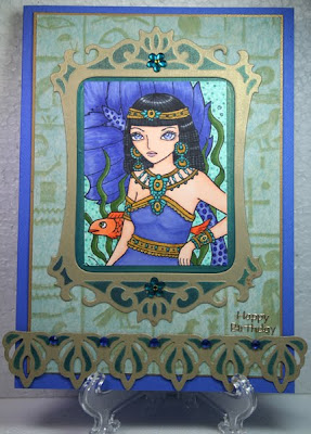
I needed a birthday card and felt like playing around. I hadn't liberated my Sweet Pea stamps in forever and a day and hadn't ever inked this one yet, so it qualifies as "new" in the challenges below.

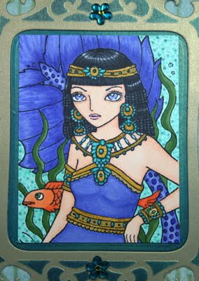
It's ching chou-kuik's Egypt Mermaid (see page 18) by Sweet Pea Stamps.


Close-up


Copic markers were used to color the stamped scene and to color light blue flower rhinestones.

Gold metallic cardstock was die cut using a Spellbinders Frame Die and a Spellbinders border die. I kept the cardstock in the dies and sponged Teal Blue and Azure StazOn ink onto the raised embossed areas as well as the innard part of the frame.

The hieroglyphic patterned vellum from a very old Club Scrap kit was adhered onto aqua cardstock. The sentiment is a Stampendous sticker from an assortment that I've had forever.

So, to summarize: the newly inked stamp qualifies as the "new" element. The Club Scrap vellum, Stampendous sticker, and old StazOn inks meet the "old" criteria.

Lastly, I'm thinking of giving this card to my sister since she's hitting the mid-century mark and is bumming. I figure that "You're not as old as Cleopatra" might work. *snort*

Thanks for visiting today!

I shall be entering this card into the following challenges:
• Simon Says "Something Old and Something New" Challenge
iCopic Weekly Challenge #63: Smooth & Shiny Hair
• Sentimental Sundays: Challenge #83: "Anything Goes"
• Delicious Doodles "All Things New" challenge

Wednesday, January 4, 2012

Magical Birthday card

Once upon a time, a traveling wizard visited a castle owned by a lovely fairy and found a lonely little cat who spent all her time sitting in a window, watching the birds and the fairies, and wishing she could fly with them.

The wizard spent some time with the cat and was very taken with her gentleness. He decided to grant her wishes as a special birthday gift for his hostess.


Close up of magical kitty to show the sparkle on her wings!


The card features Third Coast's Sarus Suggests (FA-254-I), the Open Window (CH-755-G), Stone Bench, and Kitty Fairy (CH-681-G).

All elements of the scene were colored with Copic markers. The floor and the stone wall was drawn in with Copic markers as well. The kitty's wings were painted with a layer of Iridescent Purple Twinkling H2Os.

The sentiment is from the Fairy Fantasy Unmounted Sheet by The Enchanted Gallery and was embossed with Queen's Gold embossing powder by Ranger Industries.

Krylon Gold Leaf pen and German Dresden Foil Borders were added. You can find a lovely selection of Dresden Foil at Retro Cafe Art Gallery.

Thanks for visiting today!

I shall be entering this in the following challenges:
• Outlawz ProMarker/Copic Challenges "Anything Goes" Challenge
Crafting For All Seasons #17 -- Fairies
Flutterby Wednesdays: Challenge #184: "Open" challenge