Saturday, September 29, 2012

My Skull

Ha! Whoever thought I'd have a post entitled "My Skull"? Or who would've thought that I'd say such things as "I've got to go outside to take photos of my skull"?

Obviously, it's not the skull that holds my (putative) brains, eyeballs, teeth, etc. It's a styrofoam skull from Michaels. It was cute, but screamed to be decorated.

So I listened.


Close up #1:


Close up #2:


Close up #3:


I cut Flashing Tape (foil tape used for something or another by Flashers) into 2" pieces and ran some through my Big Kick in a Steampunk Parts Vintaj Embossing Folder, a Honeycomb Texture Fades Embossing Folder, a Cuttlebug Clockworks Embossing Folder, and a Cuttlebug Spots N Dots Embossing folder.

I added additional texture to these foil strips using a Tonic Craft Scratcher, a wheelie sewing thing, and a ballpoint pen.

The embossed and distressed tape was then layered onto the skull and pressed into place. When I was happy with the coverage, I scratched the tape up some more, then painted it with a Black Paint Dabber. I immediately wiped it off, which left black paint in the recessed areas. I added another coat of paint, repeated the process, then let it dry. When I came back to it, I sanded the paint off in various places using the Vintaj Metal Refining Block.

The next step was to cover a piece of plain Grungeboard with Flashing Tape. Sadly, I ran out and had to go to Home Depot to get more. Thankfully, there were no flashers in the aisle with the Flashing Tape. I did discover that it comes in a variety of widths, which was good to know. I finished taping the Grungeboard, then die cut a Weathered Clock from it and a mess of Mini Gears. These were pounded within an inch of their lives with Tim's Texturizing hammer. They were also scratched up a bunch. When I was pleased with the level of distressed texture, I used alcohol inks to add some color to them.

Then I tried to attach the gears to the clock using a variety of glues. None worked, so I got out my hot glue gun (a gift from my dear friend Alison) and was thrilled to find that it worked. So, I glued the gears to the clock, then glued the clock to the skull. Small red paper roses were hot glued to the eye sockets to add some color and more texture to the piece. Since I'm still a relative glue-gun novice, I ended up with a lot of strands of hot glue, but I decided that they added to the look and kept 'em.

The skull came with a hook on the top, so I added a bit of metallic floss and called it done!

Friday, September 28, 2012

Susana Loves Stamps Release Blog Hop!

It's time for another exciting SCACD Stamp Release!!! SCACD is thrilled to bring you the follow-up to the wonderful Eyes of Beauty and Dreams Collection with the newest Eyes of Adventure and Fables Collections. We definitely think the Eyes have it!!! These eyes just capture your heart and imagination! Each stamp comes with an accessory image or a sentiment.

In honor of this fabulous new release, we're having a blog hop! You should have gotten here from Melanie's blog, where I'm sure you got to see some fabulous artwork!

Today I get to introduce Bonjour Eyes, from the Eyes of Adventure Collection!


Bonjour Eyes was stamped onto Neenah cardstock using Tuxedo Black Memento ink. She was colored with Copic markers (listed below the hop list) in colors to match the patterned paper from the Paris Girl 6x6 pad by Carta Bella. I touched up her earrings, fascinator, and fan with a Blossom Copic Glitter pen to add a touch of sparkle.

The sentiment was stamped using Onyx VersaFine ink, which is fantastic for detailed stamps or small sentiments.

SCACD's Ornate Hinge die was used as an embellishment that would direct your eye to the gorgeous image. Copic colored Zva rhinestones were added to the hinge for a final touch of bling.

I also get to introduce you to Courageous Eyes from the Eyes of Adventure Collection!


Courageous Eyes was stamped onto Neenah cardstock using Tuxedo Black Memento ink and colored with Copic markers (listed below). I just let Courageous Eyes dictate the color palette and then chose papers afterwards. That was oddly thrilling for me. Gelly Roll Pure Sparkle Glitter pen added a bit of sparkle to her necklace and pendant.

I chose to use the gorgeous new Fair Skies 6x6 pad from the Farm House Paper Company. The blue, blue polka dot, and striped papers are from that pad. The gold patterned paper came from the Beautiful Moments 6x6 pad by Carta Bella.

The Classic Corners die by SCACD was used at the top of the card and SCACD's Ornate Hinge die was used to anchor the sentiment. Again, Copic colored Zva rhinestones were added to the hinge for a final touch of bling.

I'd be remiss if I didn't tell you that these new stamps are deeply etched rubber that yield an amazingly detailed impression! Just check out those eyelashes!

All the Eyes of Adventure and Fables Collections are now available at SCACD and at Quixotic Paperie.

Now that you've seen these two fabulously detailed gorgeous new stamps, hop along to Dianne's blog to see what she's got to show you!

If you've gotten lost along the way, just visit the Hearts & Hugs blog!

****
Copic markers used:
Bonjour Eyes
Skin: E0000, E000, E00, E1, R20
Eyes: B21, B34
Hair: B41, C3, C4, C5, C6 C7
Gown, Fascinator, Fan: Custom Less-than R81, R81, R83, R85
Rose Petal: YG93, YG95

Courageous Eyes

Skin: YR0000, YR000, RY00, RV000, RV00
Hair: W0, W1, W2, YR20, YR30, YR31
Eyes: B63, B66
Shirt: B60, B63
Sandals Gauntlet: E21, E23, E25
Falcon: E41, E42, E43, E44
Sword: C00, C0, C1, C3, Y21, Y23, Y26

Wednesday, September 26, 2012

Bombshell Stamps' "Think Pink" Hump Day Hop!

Here's what Alison, our lovely and talented Hop Day Captain, said about this month's theme.
This theme is a little more specific then last month's. I want you to create a card or project that could be sent to someone during October, which is (here in the States), Breast Cancer Awareness Month. So let's all Think Pink!

You can go with a pink card, Girl Power, use the famous pink ribbon symbol, etc. But we want to celebrate those ladies who are fighting (or have fought) for their lives.

Welcome to the last stop on the hop! You should have gotten here from Sparkly Mary's blog, but if you got lost along the way, the complete hop list is below.

Here's my card!


Pimpin' Wolf stamp from the Sugar Daddy set by Bombshell Stamps was stamped onto Neenah cardstock using Tuxedo Black Memento ink. The wolf was colored with Copic markers (listed below). His nose, eyes, and teeth were highlighted with Gelly Roll Glaze pen to add dimension and shine.

Nestabilities Labels 28 dies were used to die cut patterned cardstock from the Sultry collection by Basic Grey.

The sentiment, by AMuse Stamps, was stamped using Onyx VersaFine ink, which is fantastic for detailed stamps or small sentiments. It was then die cut using the Fancy Labels Die. Pumice Stone Distress Ink was sponged over the cardstock while the cardstock was still in the die.

I found the ribbon on the net, printed it out, temporarily adhered it to hot pink patterned cardstock from the same Sultry collection, and used my Fingertip Craft Knife by Fiskars to cut it out. I love that craft knife because it gives me amazing control when used with a glass craft mat. I honestly don't know how I was able to craft without it!

Here's the Copic list:
Fur: E41, 43, 44
Eyes: YR35, 38
Clothing: Custom-less-than R81, R81, R83, R85
Shoes: R85, R89
Teeth: Y0000, Y000
Ground: E41, E42
Outline: W00, W0

Thanks for visiting today!

Here's the hop list:
Bombshell Blog
Alison
Kelli
Alaine
Glittery Katie
Torrey
Emily
Lizzie
Jodi
Stempeliejente
Jenn
Kim
Rachael
Susie
Sparkly Mary
Kathi

Friday, September 21, 2012

Cats @ Kath's

I love cats and all things associated with them. I love cat stamps and collect them. Therefore, I HAD to have Kraftin' Kimmie's Bella because Bella has two cats. Plus, she's got a skull barrette and a skull on her outfit. That made her perfect for Halloween. I've been feeling Halloweenie because it's getting cooler here in the Northeast. Apparently, I've also been feeling the green and purple combo. Go know.

So I decided to make a card using Bella and this sketch.


Here's the card:


Bella was stamped with Tuxedo Black Memento ink onto Neenah cardstock. She was colored with Copic markers, which are listed below. Her skull barrette was highlighted with a Gelly Roll Glaze pen to add dimension and shine. The cats' eyes and noses were touched with Black Copic Spica Glitter pen because they needed to sparkle. They told me.

The patterned papers are all from Echo Park's Chillingsworth Manor 6x6 pad.

I didn't feel like using a flower and decided to see if I could make an edgier looking flowerish embellishment using one of the gorgeous Garden Corners dies by SCACD. I'm fairly pleased with the result. I added a lime green button from my huge button stash and threaded the button with Pumpkin Scrappers Floss. The card was finished with two sets of three orange rhinestones from my stash.

Copic List
Skin: E000, E00, E02, E11, R20
Hair: V000, V1, V93, W5, W6, W7, W8
Dress: V91, V93, V95, YG000, Yg00, YG01, YG03, W00, W0, W1, W3
Cats: T4, T5, T6, T7

Thanks for visiting today!

I shall be entering this card in the following challenge(s).
Kraftin' Kimmie Challenge #146

Wednesday, September 19, 2012

Bad Dragon Pun card!


Meet Dragon Biff (PR-035-R)from Third Coast Rubber Stamps. I don't think he breathes fire. I think he's way mellower than that. I think he's a New Age hipster dragon because of his feathered and fluff-ball earrings. I think he's the perfect dragon to cheer up someone who is draggin'. Just sayin'. Plus, I think I clearly think too much.

Anyway, Dragon Biff (PR-035-R) was stamped onto Neenah cardstock using Tuxedo Black Memento ink, then colored with Copic markers. He's a bit like a mood ring and changes colors with his mood. Today he felt like being bright green and purple with blue feathers and orange sparkly eyes. Why wouldn't he? His eye was touched up with a Gelly Roll Pure Sparkle Glitter pen, then coated with Gelly Roll Glaze pen to make 'em shiny and dimensional as well as sparkly. His fangs were also coated with the Glaze pen. I run through those things like water!

I found the perfect papers to match him in some old Basic Grey 6x6 pads, namely Euphoria and Marjolein. I just layered 'em up and added a punched border that reminded me of his teeth. The sentiment is Doodlebug rub-ons (why did they stop making this size???) onto a die cut cut from Basic Grey lined white paper from an ever-so-useful Basics White pad. The smudges are from my still inkstained fingers. Oh well. Perfection is overrated.

Thanks for visiting today!

Something old, something new...

Nothing borrowed, but oh-so-blue all in honor of "Talk Like a Pirate Day"!


Bombshell Stamps' Ms. September, Lizzie, challenged us to use paint spatters in our project. So I stepped outside my comfort zone and went for it.

AC Moore has individual Distress Markers on sale plus I had an additional coupon for $5. off $15, so I splurged and bought several to try. They furnished the "new" aspect.

The "old"? A Pirate's Life was one of my first sets from Bombshell Stamps!

Now for the details. I stamped the Pirate Wench using Onyx VersaFine ink onto watercolor paper. I used my limited palette of Distress markers to color the pirate wench. I didn't have enough colors, especially for her skin, so I used my Distress pads. A while back, I got an Inkssentials Craft Nib Holder and love the control it affords. I used the tool, Craft Nibs, and a water brush to add some additional colors. Pentel gold gel pen was used for her earrings and various (swash)buckles.

Wenchie was then masked, die cut, and sponged with Distress inks.

I created two spray mists using Perfect Pearls Metallics (Pearl), Pastels (Turquoise), Jewels (Forever Blue), Distress re-inkers, Inkssentials Mini-Misters, and water.

The turquoise, the lighter of the two, was sprayed then sponged onto watercolor paper. The darker azure was sponged over the Fish Scales stencil by The Crafter's Workshop. This produced a very subtle effect and left very wet paper, which I heat set.

Pearl Paint Dabber was mixed with water on my craft sheet, then splattered all over the background. I was feeling impatient, so I decided to see what would happen if I heat set the Paint Dabber. The paint bubbled, burst, splattered a bit more, and left a cool raised texture look.

I grabbed a piece of metallic white cardstock, went through the same processs using the same Fish Scales stencil and was left with a mess, so I just spread the ink and achieved a very subtle fish scale look. This was heat set, then the sentiment from the Ahoy Sailor set, was stamped with Onyx VersaFine ink.

An anchor charm, a gold brad, and metallic gold pearls were used to finish the card.

BTW, the image was pop-dotted to raise it over the sentiment strip. Hence the shadow.

By the way, feel free to participate in Ms. September's "Splatter" challenge. Share your artwork with us on Bombshell's forum or on Bombshell's blog for a chance to win your choice of a free set of Bombshell Stamps!

Thanks for visiting today.

Friday, September 14, 2012

Teaser for Bombshell's Fabulous Friday Tutorial!

Want to learn how to create a multi-colored flame background using Distress Inks and the Flames stencil from the Crafter's Workshop?

Fridays are always fabulous at the Bombshell Stamps blog because they feature tutorials from the talented Bombshell Girls and Pin-Ups.

I decided to celebrate my birthday month by stepping up and creating a tutorial. Click HERE to be whisked over to the Bombshell Blog to check it out!

Here's my finished card, which also uses my September sketch for Bombshell!


In addition to the Flames stencil, I also used one of the three silhouette motorcycles included in Bombshell's Let's Ride set. The motorcycle was stamped with Onyx VersaFine ink to give better coverage. I still had to go over the image with a Prismacolor marker to deepen the black silhouette.

The patterned papers are from the Very Vintage Double Dots 6x6 pad by Bo-Bunny.

I'm getting trendy by using both Hazard Washi Tape and Roadway Washi Tape on the card. Three black rain dots were used to add the finishing touch to the card.

BTW, if you go check out the tutorial, you should know that you can also use the Copic markers and the airbrush system to create a similar result.

Thanks for visiting today!


Thursday, September 13, 2012

Happy Birthday to me from me with love! :D

Since it's my birthday (29 again), I felt like making a birthday card, especially since those are always useful.

I used this sketch from Sketch Saturday.


Here's my take on it!


More Celebrate Cake
from the Little Sassy Crew Collection by Susana Loves Stamps was stamped with Tuxedo Black Memento Ink and colored with Copic markers (listed below).

Once it was colored, I used Nestabilities Wonky Rectangles to die cut the image. I thought that the crazy cake would look great in the Wonky Rectangles. I left the cardstock in the die and sponged Old Paper and Pumice Stone Distress Inks over the die and onto the cardstock.

The stars on the flower looked like sparklers to me, so I added a Gelly Roll Stardust Pure Glitter Pen to make them sparkly.

The layered patterned papers are all from the same MME Indie Chic Citron 6x6 pad (which is sale!!!). All edges were sponged with Pumice Stone Distress ink.

The sentiment, from the late lamented Odd Bird Planet, was stamped using Onyx VersaFine ink and die cut using Spellbinders Framed Labels One. The flower is by Petaloo and started out white, but was colored using the Copic Airbrush system.

I finished the cards with some Snow White pearls by KaiserKraft.

Copic markers used on the image were:
YR00, YR01, YR02 for the roses, which really are more orangey irl
Y0000, Y21
BG70, BG72, BG75, BG78
YG93, YG95, YG97

Thanks for visiting today!

I shall be entering this card in the following challenges:
Sketch Saturday
Craft Your Passion #127 "Blast from the Past" (#126 Floral Images or #124--Power of Three)
Simon Says "We"re So Trendy" -- Chevrons

Wednesday, September 12, 2012

September Bombshell Sketch Challenge!

One of my roles as Captain of the Bombshell Design Team is to create a monthly sketch.

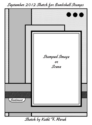
Here's September's sketch:


Here's my take on the sketch:


A while back, I saw Tim Holtz demonstrate a technique using his Kraft Glassine. Whereas I do have some Kraft Glassine, I also have these handy dandy white glassine envelopes courtesy of the USPS. They pack stamps in them when you purchase them. I kept those envelopes figuring that one day I'd do something with them.

Today was that day. I stamped the ship from Bombshell's Homeward Bound set onto the white glassine using black StazOn ink. I let it dry for a bit, then flipped the glassine over so that I could color on the reverse and not have the StazOn ink smear and/or ruin my Copics. I discovered that I had to go with darker colors than I'd ordinarily use to have it show on the opposite side. I colored the sky and the sea using older Prismacolor markers.

Then I took a heat gun to the image and heat set both sides of the piece until both sides looked waxy, which meant that the ink had been absorbed into the glassine. There are a few spots where I scorched the glassine, but the scorch marks added to the vintage look. When the piece cooled down, I tore the edges of it, crumpled it up, smoothed it out, and then stapled it to a black on white clock patterned paper from 7 Gypsies using my Tiny Attacher.

The other papers are all from 7 Gypsies too, except for the card front, which is by Basic Grey.

I used pink and orange ribbon from my stash that repeats the color of the sun. The sentiment was added with Doodlebug rub-ons. Three tiny star brads were added to finish the card!

You should play along with this sketch and share it with us on Bombshell's Forum and on the Bombshell Blog. Feel free to flip, flop, and make the sketch your own. The only rule is that you have to use a Bombshell stamp (free digis are on the forum!). By playing, you get a chance to win your choice of a free set of Bombshell Stamps!

Thanks for visiting today!

Tuesday, September 11, 2012

Paper-piecing fun & a plethora of challenges!

Don't you love the word "plethora"?

Anyways, this card meets a plethora of challenges, including a paper-piecing challenge, a sketch challenge, and a stamping challenge.

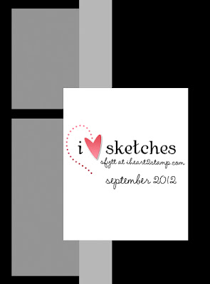
Here's the September 2012 sketch by I Heart to Stamp


Here it is!


The card features my new Bambi Bubblegum stamp by Kraftin' Kimmie. She was stamped using Tuxedo Black Memento ink onto Neenah cardstock. Her face, neck, and arms were colored with Copic markers.

She was also stamped two more times, again using Memento ink, onto patterned cardstock (polka-dot and sheets) from the Beautiful Moments 6x6 pad by Carta Bella. I then added shading to her hat, pants, and shirt using Copic markers. When I was happy with them, I "fussy cut" them using my beloved Fingertip Craft Knife and Micro-tip Scissors, both by Fiskar's. The clothing took a trip through my Xyron X to apply adhesive, then were adhered in the proper places.

Stamped and clothed Bambi took a ride through my Big Kick and was diecut using Nestabilities Labels 14. I kept the cardstock in the die, then sponged around it using Spun Sugar Distress Ink.

The layered papers are all from the Beautiful Moments 6x6 pad by Carta Bella. My sole deviation from the sketch was to add the sentiment, which was stamped with Onyx VersaFine ink, diecut, then sponged with Spun Sugar Distress ink.

When the card was almost all assembled, I added Glossy Accents to the gum bubble and the glass part of the gumball machine. Then I put it out of reach until this morning. I wish the photo showed the dimension and shine created by the Glossy Accents!

Here's the list of the Copic markers used:
Skin: E0000, E000, E00, E01, and R20
Hair: YR30, Y21, W1, W3
Lips: r56
Hat & Pants: W00, W0, W1, W3, W5, W6
Shirt: WOO, W0, W1, R000
Shoes & Gumball Machine: R56, R59, R89
Glass: BG70, BG90, BG93
Bubble: R81, R83

Thanks for visiting today!

I shall be entering this card in the following challenges:
I Heart to Stamp: September SFYTT
Kraftin' Kimmie #145 Piece Out
Simon Says Challenge: Put a Stamp On It
Craft Your Passion #127 "Blast from the Past" I chose #99--Paper Piecing.

Friday, September 7, 2012

Big News & a card to celebrate!

I'm over-the-moon excited that I was asked to join the design team for Susana's Custom Art & Card Design! If you don't know this stamp manufacturer AND store, I urge you to check it out asap. Be sure to spend some time perusing the store as there's a fabulous assortment of goodies! Then hop over to the Hearts & Hugs blog, where the seriously talented SCACD dt ladies share their artwork!

Here's my first official card for the team!


The focal image is Rockstar Eyes (Alex) from the Eyes of Beauty and Dreams collection.

I've had her for awhile and love that she's cute and edgy at the same time, which makes her perfect for Halloween! Yay!

She was colored with Copic markers. I intentionally kept her vampire-pale to make her look a little edgier. The scan kind of washed out her leg color, but hey, my legs are probably that pale! I added a touch of Gelly Roll Stardust Pure Glitter pen on her eyes and on the skull's eyes. Then I added some Sand Copic Glitter pen to her wings to make them shimmery. I don't know if that shows up in the scan.

I masked her with Judikins Eclipse tape, die cut her with Spellbinders Nestabilities Labels Four (which are on SALE!!!), then airbrushed the background with E42 while the cardstock was still in the die.

I layered patterned papers from the new Lost & Found Halloween 6x6 pad by My Mind's Eye, added the stamped piece, then die cut brown cardstock with the fabulous Alice's Clock Statement Corner, which is a SCACD exclusive die!!! Isn't it gorgeous?

I didn't add a sentiment because:
a) I think the card would work for other occasions besides Halloween.
b) I haven't decided who will receive it and for what occasion.
c) both of the above!

BTW, Rockstar Eyes was named for my friend Alex who loves ravens like the ones on the patterned paper.

Thanks for visiting today!

I shall be entering this card in the following challenge(s).
Simon Says Stamp Challenge "Put a Stamp on it"


Thursday, September 6, 2012

'Tis the season!

No! Not that season. My favorite season...

Labor Day has passed. The kids have gone back to school! The days are getting longer. All that means is that Halloween approacheth! Since it's my favorite season, I have a very large collection of Halloween-themed stamps, papers, and other goodies (that don't go thump in the night).

Third Coast Rubber Stamps has tons and tons of fun and fabulous Halloween stamps. Here's a card that features one of them that just joined my collection.


The stamp is called Witch's Supply Truck (DT-339-P), which can be found on page 12 of the Halloween 2008 supplement.Doesn't it remind you of one of the food trucks from The Great Food Truck Race on the Food Channel? Too bad there's not a Tyler Florence stamp. That would be amazing!

Here's a close-up to see the fabulous goodies that are on the truck.


I did something I rarely do. I colored it before I chose the patterned papers. As usual, I used Copic markers. I used way too many to list, so I won't. *grin* There's Glaze pen over the windshield, headlight, and all the glass jars and bottles. Sadly, the photo doesn't show their glassy shine.

The patterned paper is from an old 6x6 Eerie pad by Basic Grey. I never really could figure out what to do with that specific paper, but this works for me! I added a vellum light beam because I could. The sentiment was die cut using the banners by Alterations. I used some very, very old rub-ons from back when I was in publishing and did paste-up mechanicals. Now that dated me, didn't it? Anyways, both the truck and the sentiment banner were popped up on dimensional adhesive. I used some nifty new-to-me roadway Washi tape for the roadway.

Thanks for visiting today!

I shall enter this card in the following challenge:
Simon Says Stamp Challenge "Put a Stamp on it"

Tuesday, September 4, 2012

Steampunk Pink -- Third Coast Coterie Challenge!

Here's my card for the Steampunk Pink challenge over at the Third Coast Coterie Challenge Blog!

Leigh, our lovely and talented challenge coordinator says:
You can make anything you want...card, ATC, altered domino if you're still rocking the doms or tag, etc, as long as it screams Steampunk!

The twist for this challenge is you MUST incorporate the colour PINK into your projects!

We want to see all kinds of Steampunk projects from grungy pink to fluffy bubblegum pink and anything in between. So whatever your style is or favourite shade of pink your project is welcome here ;0)

TCCC#4 runs for nearly 2 weeks and ends on Sept 12. Winner and Coterie Top 3 will be announced Friday Sept 14 when the next challenge starts.

One randomly drawn winner will receive a fab $25 gift certificate to Third Coast Rubber Stamps!

Here's my card!


Danica (VB-138-L), found on page 15 was colored with Copic markers. I added two tiny watch parts to her hat to give her more of the Steampunk vibe.

Danica is walking on a sidewalk composed of Single Gear Small (CO-284-EE) from page 14 of the Spring '12 supplement, which were stamped in Grey Flannel Memento ink and colored with Copic markers. She was masked with Winsor & Newton Masking fluid. Cool Gray 00 & 01 were airbrushed through the Steampunk stencil by The Crafter's Workshop.

Gear Corner Narrow (CO-278-G) from page 16 of the Spring '12 Supplement was stamped, "fussy cut", and adhered to the matted scene with brads.

Pink cardstock took a trip through my Big Shot in a Sizzix Alterations (Gears) folder and was sponged with Slate Grey Ancient Page ink to make the gears pop out a bit more. This was layered over some very, Very, VERY old KI Memories silvery alphabet paper that had taken a ride through the Big Shot in a Cuttlebug Timeworks folder.

The card was finished with a sentiment from the late, lamented Odd Bird Planet, which was stamped onto a QuicKutz ribbon slide, which was slid onto a silver ribbon.

Thanks for visiting today!


Sunday, September 2, 2012

Super Mom to the rescue!

Whereas I am not a super mom, nor do I play one on tv, I do have a super mom of my own, so when I saw this Super Mom image from Kenny K Downloads, I had to have it!

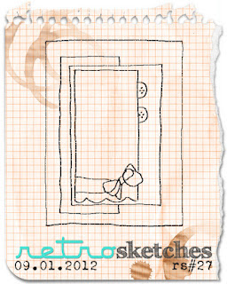
Here's my first card using the digital image. I also used sketch #27 from Retro Sketches Challenge Blog.

Here's the sketch:


Here's my take on the sketch:


I recently got my hair cut and colored, so I tried to match my new color on Super Mom's Hair. I think my hair is still a bit redder, though it's about that length, but not as stylish.

I colored Super Mom with Copic markers, which I know is a big shockeroo to you all.

Here are the markers I used for the:
Face: E000, E01, E11, R20
Lips: R20, R22, R24
Hair YR30, E51, E53, E55, E57*
Blouse: BG11, BG23, BG32, BG34, BG93
Skirt: E74, E77, E79
Apron: W1, W3, RY20, YR21, YR24, YR27

*My E11 & E55 have gotten goopy, so there are some shiny spots in the hair, which is ever-so-irritating. *sigh*

The patterned papers are from the Mabel 6x6 pad from the Stella & Rose collection by MME.

The ribbon is from my stash. I changed the light blue to match using BG23. I added a pearl earring to finish off the card.

I will use this card for my Mom at some point. I'm safe because she doesn't read my blog.

Thanks for visiting today and happy September!

I shall enter this card in the following challenges:
Retro Sketches #27
Color Me Creative Classroom Challenge #51 Yellows