Thursday, July 30, 2015

Metallic and/or Shiny!

I just realized that I hadn't shared the ATCs and cards that I created for the Stampotique Metallic and/or Shiny ATC swap! I don't know if it's a function of getting older, but lately time seems to be ever more fleeting and my short-term memory also seems to be growing shorter.

So without further ado, here is the first ATC, with Stampotique's Snowy (Kira Nichols).

Snowy was stamped with Tuxedo Black Memento ink (Tsukineko/Imagine crafts), colored with Copic markers, fussy-cut, then edged with a black marker.

An Inkssentials Metal Foil sheet (Ranger) was die-cut with a Labels Eight Nestabilities die (Spellbinders).  A Gold-colored metal sheet was first cut with one of the dies from the D-Lites ATC Shapeabilities set (Spellbinders), then an aperture was cut from it with the same Labels Eight Nestabilities die used to die-cut SnowySnowy was inset into the ATC, holes were poked at the top, and gold thread was threaded through the holes. This was set aside for a little while.

140 lb. Mixed Media cardstock (Strathmore) was die-cut with one of the aforementioned D-Lites ATC dies, then painted with Dark Grey Value 3 Media Fluid Acrylic (MFA) paint (DecoArt). A small scoop of White Media Modeling Paste (DecoArt) was scooped onto a plastic lid, a few drops of Medium Grey Value 6 was mixed into the paste, then spread over the Bricks stencil (The Crafter's Workshop), and allowed to dry.

While it was drying, I cut a very thin strip of the gold metal sheet and ran it through my Dymo Label Maker to create the sentiment.

When that step was completed, the tinted Media Modeling paste was dry. I poked a hole in the top, stuck a brad into it, hung the gold framed mirrored Snowy from the brad, and put the sentiment strip over top of the threads. The edges of this piece were sponged with Black Soot Distress ink (Ranger) and the piece was matted onto a black ATC.

The ATC would have gotten lonely on its long trip to Australia, so I created a card to go with it.

Here's a jpg of that very card which features one of the dwarfy gnomes from Stampotique's Three Dwarfy Gnomes (Kira Nichols).

The center dwarfy gnome from Stampotique's Three Dwarfy Gnomes (Kira Nichols) was stamped with Tuxedo Black Memento ink (Tsukineko/Imagine crafts) and colored with Copic markers. I used my markers to draw in grass and to add a cloudy sky.

The Dwarfy Gnome image panel was die-cut with some Nestabilities dies set or another, then matted onto yellow patterned paper from Cupcake, an old Basic Grey collection.  The next layers of Cucake patterned paper were also die-cut with that set, then adhered to the card front. The yellow patterned paper was also die-cut with a stitched borders included in the Blueprints Two die set (Die-namics). The sentiment was computer generated, then die-cut with one of the dies from the Stitched Speech Bubble Edges (Die-namics). A very old buckle die (QuicKutz) was used to die-cut gold metallic cardstock. The buckle was added to the stitched ribbon, the speech bubble was adhered to the top of the card front, the card front was likely sponged with some Distress ink, then mounted on the yellow card.

Thanks for visiting today!

Friday, July 24, 2015

My Nat'l Dance Day card

This week's challenge theme at The Outlawz Coloring Challenges is "Dance" because tomorrow is National Dance Day. My Outlawz Coloring Challenge teammates, Carla, Penny, Karen, Vannessa, and I challenge you to use create a project for this challenge.

Our July sponsor at The Outlawz Coloring Challenges is Sweet Pea Stamps, who is offering our lucky winner three digis of his/her choice from the Sweet Pea Digi Stamp Store.  Play along with us for your chance to win!

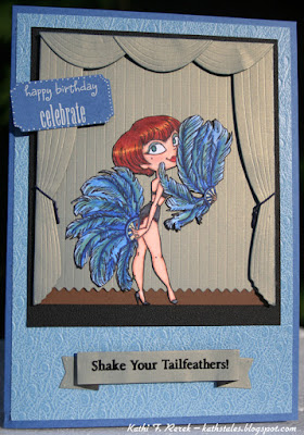
Here's my card with one of the showgirls from Kraftin' Kimmie Stamps' Show Stoppers set.


The showgirl was stamped with Tuxedo Black Memento ink (Tsukineko/Imagine Crafts), colored with Copic markers, fussy-cut, and edged with a black marker. A touch of blush was added to her cheek with palette chalks.

The background was created with the Take the Stage die set (Die-namics). The silky-looking paper is Shantung specialty paper by FiberMark. I edged the curtains with blue marker to add a touch of blue to the jade greenish fabric-finish curtains. The backdrop was adhered to brown cardstock andDimensional foam adhesive was used between the backdrop and curtains. The little tie-backs were included in the set. Aren't they cute?

When I was done putting the stage together, the showgirl was adhered, the piece was matted onto black cardstock, and onto a card front cut from Blue Quills, a feather-textured specialty paper (FiberMark). 

A scrap of the Shantung paper was die-cut with one of the banners from the Dimensional Banner die set (Die-namics). The sentiment was stamped onto the banner with Jet Black StazOn ink (Tsukineko/Imagine Crafts) and heat set. 

Blue cardstock was die-cut with a ticket die (QuicKutz) and rub-ons (also by QuicKutz) were  used to add the sentiment. A white gel pen was used to add a bit of detail to it.

The ticket and the banner were added to the card front and the card front was adhered to a blue card.

Thanks for visiting today!
I shall enter this card into the following challenges:
Kraftin' Kimmie's Blog: Wonderful Wednesday Anything Goes 
7 Kids College Fund Challenge Blog: Anything Goes
Craft Gals Corner Challenges: To Die For

Thursday, July 23, 2015

Birthday Fishes!

SCACD's new rubber stamp release included a gorgeous set of tropical fish called The Angelfish Trio, which is available as an unmounted sheet of deeply edged rubber.

Here's my first card using the largest fish of the Angelfish Trio.


The large angelfish was stamped onto Neenah cardstock and onto Eclipse Tape (Judikins) with Tuxedo Black Memento ink (Tsukineko/Imagine Crafts). The Eclipse Tape angelfish was fussy-cut and set aside. The angelfish on the image panel was colored with Copic markers, which were chosen based on an angelfish I found on a Google image search. Who knew there were so many beautiful and distinctive colorations for angelfish?

When I was done coloring the angelfish on the image panel, the Eclipse Tape version was adhered over it then airbrushed with the Copic airbrush system using a variety of BG markers. When I was happy with the background, the Kelp Forest stencil (The Crafter's Workshop) was placed over the background, secured with Washi tape at top and bottom, then airbrushed with a few YG markers.

The image panel was cut to size and set aside while I started die-cutting flora and fauna to enhance the scene.

White cardstock was die-cut with the Oceana Corner die (Memory Box) and Build a Scene Underwater dies Taylored Expressions).The white die-cuts were colored with Copic markers, enhanced with the Uni-Ball White Impact Gel pen, and adhered to the image panel.

Clear pearls and some Clear Gelly Glaze pen (Sakura) air bubbles were added to the background.

The "Hello Friend" from the In'Spire Celebrate 2 die (Spellbinders), "Best Wishes" die (Elizabeth Craft Designs), and "Happy Birthday" die (Elizabeth Craft Designs) were used to die-cut greenish cardstock. "Friend" and "Wishes"  underwent some transplant surgery, then were adhered to the card front.

The image panel was matted with greenish cardstock and mounted onto a green card.

Thanks for visiting today!

I shall enter this card into the following challenges:
Craft Gals Corner Challenges: To Die For
Crafty Cardmakers and More Challenges: Water
AAA Card Challenges: Waterworld and Dies

Wednesday, July 22, 2015

Use Household Objects!

Arwen McCullen is the hostess this week at Stampotique Designers Challenge Blog and her challenge is to use a household object to stamp your background. Here's what she had to say about her challenge:

"Stamp a background with things from the budget. For example, sponges, foil,
cutlery."
If you'd like the chance to win your choice of $30 worth of Stampotique stamps, you should play along with this challenge. Visit Stampotique Designers Challenge blog and be sure to read the rules so that you'll have the chance to win that great prize!!!

Here's my card with Stampotique's Amazon (Kylie DiOrio).


Amazon was stamped with Tuxedo Black Memento ink (Tsukineko/Imagine Crafts), colored with Copic markers, fussy-cut, then edged with a black marker.  Amazon's eyes, beak, and talons were coated with several layers of Clear Gelly Glaze pen (Sakura) to give them dimension and shine).
Amazon was set aside while I created a suitable background for him.

Since we do a lot of online shopping, we have quite a supply of bubblewrap with bubbles of varying sizes. I found a piece of bubblewrap with large bubbles, which I painted with Titanium White Media Fluid Acrylic paint (DecoArt). The bubblewrap was immediately inverted onto a piece of 140 lb. Mixed Media cardstock (Strathmore) and pressed into the surface using both my hands and a brayer. The brayer seemed to be the more efficient of the two paint transfer methods.

The cardstock was peeled away and the bubblewrap was set aside. I thought that the bubblewrap impressions might look like clouds and was pleased that I was right. 

Forget-Me-Not and Cornflower Blue Archival inks (/Ranger) were sponged onto the cardstock over the stamped bubblewrap to create a blue sky. I like my skies to have a touch of pink in them so Spun Sugar and Picked Raspberry Distress inks (Ranger) were randomly sponged here and there. Since acrylic paints resist inks, a baby wipe was used to sponge the ink off of the bubblewrap-stamped clouds.

The bubblewrap-stamped ink-sponged cardstock was trimmed to the size of a card front and set aside.

Mesh from a fruit bag was taped over a scrap of kraft cardstock and Gathered Twigs Distress ink (Ranger) was sponged over the fruit bag. This was die-cut with the Birds and Branch die (Taylored Expressions). Green cardstock was also die-cut with this die. The kraft version was edged with
Gathered Twigs Distress ink. The leaves were cut off the green version and detailed with a Green Sharpy pen (Sanford), then edged with a Copic marker. They were adhered over their brown counterparts.

The branch was adhered to the bubblewrap-stamped ink-sponged cardstock and Amazon was positioned atop the branch. Since Amazon looks as though he's about to say something, so Happy Bird-Day (Carol's Collection) was stamped onto a scrap of the painted/inked cardstock with Jet Black StazOn ink (Tsukineko/Imagine Crafts), cut apart, and placed onto a Conversation Bubble vellum die-cut (Spellbinders).

Thanks for visiting today! 

I shall enter this card into the following challenges:
Corrosive Challenges: To Die For 
A Gem of a Challenge: Birthday Wishes
Let's Craft and Create Challenges: Butterflies or Birds 
 

Friday, July 17, 2015

Color Challenge!

This week's challenge at The Outlawz Coloring Challenges is a color challenge My Outlawz Coloring Challenge teammates, Carla, Penny, Karen, Vannessa, and I challenge you to use create a project for this challenge. You can use any coloring medium you like, just as long as you color! 
 

Our July sponsor at The Outlawz Coloring Challenges is Sweet Pea Stamps, who is offering our lucky winner three digis of his/her choice from the Sweet Pea Digi Stamp Store.  Play along with us for your chance to win!

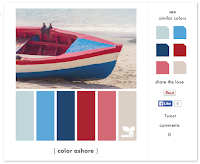
Here's the color palette, courtesy of Design Seeds.


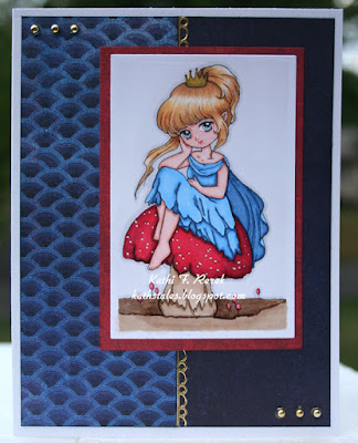
Toadstool Princess was reduced in PhotoElements, printed out with my laser printer onto Neenah cardstock, colored with Copic markers, then die-cut with one of the dies from the Card Creator Nestabilities die set (Spellbinders). Apparently, I mistook her scarf for a cape and colored it accordingly. Oopsie. Perfection is overrated and scarce in my corner of the universe.

Gold Stardust Glitter pen (Sakura) was added to her crown. It was much golder and glitterier (new word) than I thought, so I decided to use gold accents as embellishments. Red Stardust Glitter pen (Sakura) was added to the brooch on her dress. 

The patterned papers are from an old Lime Rickey (Basic Grey) 6x6 pad). The unsightly white edges were sponged with Chipped Sapphire Distress ink (Ranger). 

The gold foil border is from a sticker sheet from my stash. The gold pearls (Recollection) were used to finish the card.

Thanks for visiting today!

I shall enter this card into the following challenges:


Wednesday, July 15, 2015

Twinchies!


Janet Klein is the hostess this week at Stampotique Designers Challenge Blog and her challenge is Twinchies! Here's what she had to say about her challenge:
"Twinchies are small works of art that measure 2 x 2". Create a set of twinchies
using your favorite Stampotique stamps."
If you'd like the chance to win your choice of $30 worth of Stampotique stamps, you should play along with this challenge. Visit Stampotique Designers Challenge blog and be sure to read the rules so that you'll have the chance to win that great prize!!!

Here's my wall hanger using Stampotique's Timeless (Amy Wilson Wellenstein)


Since I'd never made Twinchies before, I decided I might as well do a two-fer, get out my newly purchased  Brusho Crystals (Colour Craft Ltd), and give them a go. As usual, before purchasing a new product, I do my research, watch videos, ask friends, and agonize endlessly before I finally go for it. I think that's because I'm not-so secretly a Virgo control freak.

Timeless was stamped onto watercolor paper (Canson) with Onyx VersaFine ink (Tsukineko/Imagine Crafts). Clear Detail embossing powder (Ranger) was sprinkled on and the excess was dumped back into the container. Here's a question: Why do you always dump more back into the container than was there before you used it? Anyway, I digressed, which is shocking. Or not.

I used my waterbrush to wet the area where I wanted color, then sprinkled on one or two colors of Brusho Crystals, and let them spread. If the colors didn't spread, I  either added a drop of water or used a paintbrush to move the color around. I repeated this step until the entire clock collage was completely colored.

The colored stamped panel was cut into four 2" sections and the edges were sponged with Black Soot Distress ink (Ranger). The four twinchies were adhered to black cardstock. The open areas of each twinchie was stenciled with Distress inks (Ranger) and the Dot Fade Layering stencil (Stamper's Anonymous/Tim Holtz).

A second piece of watercolor paper was misted with water and several different colors of Brusho Crystals were shaken onto the wet surface and allowed to migrate. I misted the paper again to make the colors move some more until I was happy with the coverage. The paper was heat set, then Timeless was overstamped with Onyx VersaFine ink, and heat embossed with Clear Detail embossing powder.

The center clock in the Timeless collage was die-cut with one of the dies from the Circles Nestabilities die set (Spellbinders), the edge was sponged with Black Soot Distress ink, then was matted onto a slightly larger metallic black circle die-cut. This circle was adhered in position over its counterpart on the project using dimensional foam adhesive. The inset clock was coated with several layers of Clear Gelly Glaze pen (Sakura) to add dimension and shine.

Metallic gold cardstock was die-cut with the Wings die set (La-La Land Crafts) and the Mermaid font dies (Die-Versions).

The wings were added to the center clock piece, the title was added along the side, and the piece was double matted.

Thanks for visiting today!

I shall enter this project into the following challenges:
Simon Says Stamp Monday Challenges: Anything Goes 
Take A Word Challenges: Wings
We Love to Create Challenges: Mixed Media/Inky

Monday, July 13, 2015

Mmmmmmmm. Chocolate!

This week's challenge at The Outlawz Coloring Challenges is  Chocolate, in honor of Chocolate Day, which was July 7th. My Outlawz Coloring Challenge teammates, Carla, Penny, Karen, Vannessa, and I challenge you to use create a project for this challenge. You can use any coloring medium you like, just as long as you color! 
 

Our July sponsor at The Outlawz Coloring Challenges is Sweet Pea Stamps, who is offering our lucky winner three digis of his/her choice from the Sweet Pea Digi Stamp Store.  Play along with us for your chance to win!


Here's my somewhat late card with Sweet Pea/Janna Prosvirina's Hot Chocolate Fairy.

It's summer, so hot chocolate didn't work for me, so I tried to make the hot chocolate look more like a chocolate ice cream soda. 

The Hot Chocolate Fairy was slightly reduced in PhotoElements, printed out with my laser printer onto Neenah cardstock, colored with Copic markers, then die-cut with one of the dies from the Card Creator 5x7 Nestabilities die set (Spellbinders). 

Clear Stardust Glitter pen (Sakura) to her necklace, then added several layers of Clear Gelly Glaze pen (Sakura) over the necklace, to the soda glass and to the chocolate heart candies. Chocolate Spica Glitter pen (Copic) was added to the ice cream to try to make it look frosty. 

Here's a close-up of the glass.


The patterned papers are ancient and are by Sharon Ann (Deja Views). I chose them because they matched the colors I had used for the fairy and because I love brown with shades of blue. One sheet of the blue patterned paper was lightly stenciled with a Ledger stencil (Stampers Anonymous) and Cornflower Blue Archival ink (Ranger), which was also used to edge the blue pieces of patterned paper. Rich Cocoa Memento ink (Tsukineko/Imagine Crafts) was also used to edge the papers.

Thanks for visiting today! 

I shall enter this card into the following challenges:

Simon Says Stamp Monday Challenges: Anything Goes 
Without Words Challenges: Blue and Brown

Wednesday, July 8, 2015

Attachers!

I am the hostess this week at Stampotique Designers Challenge Blog and my challenge is Attachers! Here's what I had to say about my challenge:
"Use attachers, the older the better.  Think of using eyelets, brads, staples, etc.  Bonus points if someone uses all three.  Extra super bonus points if someone attaches Stampotique images to each other."
 If you'd like the chance to win your choice of $30 worth of Stampotique stamps, you should play along with this challenge. Visit Stampotique Designers Challenge blog and be sure to read the rules so that you'll have the chance to win that great prize!!!


Smitten Mustache Monsters was stamped with Tuxedo Black Memento ink (Tsukineko/Imagine Crafts) , colored with Copic markers, fussy-cut, and edged with a black marker. Clear Gelly Glaze pen (Sakura) was used to add dimension and shine to all three of the Smitten Mustache Monsters' noses, and claws as well as the horns of two of the three of 'em. Glossy Accents (Ranger) was used to add dimension to Smitten Mustache Monsters's eyes. The Glossy Accents was used to add dimension to Smitten Mustache Monsters's eyes. The monsters were hidden in a drawer overnight so I would not be tempted to touch their eyes and see if the Glossy Accents had dried.

Meanwhile, two of the dies from the Card Creator Nestabilities set (Spellbinders) were used together to cut a frame from thin cardboard, which was then dabbed with Brushed Pewter Distress paint (Ranger). The first layer was allowed to dry and a second layer of the paint was dabbed on. The dabbing yielded a mottled silver/pewter look.  Another die from the same Card Creator set was used to to die-cut a smaller rectangle from thin chipboard. Holes were punched in the inside corners of the frame and the outside corners of the small rectangle.

Watering Can Archival ink (Ranger) was pounced over the small chipboard rectangle, then a few drops Concrete and a drop or two of Espresso Fresco Finish acrylic paint (Paper Artsy) were mixed into Opaque Texture Paste (Ranger) and then scraped over the Stone Wall stencil (Green Pepper Press). The stencil was lifted, the texture paste was removed from the holes in the small rectangle. This was set aside to allow the Texture Paste to dry.

When it was dry, pewter eyelets were set into all the holes in the frame and small rectangle. Two Ring Fasteners (Idea-ology) were inserted into the "wall" piece. Foam dimensional tape was added to the reverse sides of the frame of both pieces and they were adhered to textured specialty paper (FiberMark). A strand of pewter beading wire was threaded between each inside corner of the frame and the corresponding outside corner of the inside piece. The wire ends were twisted together. I'd bet that last bit didn't make a whole lotta sense. Oh well.

Time to add the Smitten Mustache Monsters to the scene. Dimensional adhesive was added to the reverse of each monster. Bits of chain and two sizes of jump rings were attached to each other to become ankle restraints. The large jump rings were slid over each monsters' ankles, Washi tape was added to the "wall" piece, and the monsters were adhered to the scene. The chains were attached to the Ring Fasteners and the Smitten Mustache Monsters were now prisoner.

Here's a close-up so you can see their chains and such.

My computer was used to create the "Tower of London Tour Tickets", which were die-cut with the Mini Tickets Alterations Strip die (Sizzix). The tickets were sponged with Distress ink (Ranger), then attached to the scene with Memo Pins (Idea-ology).

Three sentiments from the Barcode Text 2 set were stamped onto a Journaling Ticket (Idea-ology) with Deep Lagoon, Satin Red, and Olympia Green VersaFine inks (Tsukineko/Imagine Crafts). The tags were sponged with Distress ink then stapled together with my Tiny Attacher (Idea-ology)

"Bad Idea" from the Barcode Text 2 set was stamped with Jet Black StazOn ink onto parchmenty vellum. The sentiment and a silver metallic frame were die-cut with an old nameplate die (QuicKutz). This was attached to the frame with tiny metallic star brads to finish the piece.

So what do you think the Smitten Mustache Monsters did to get chained up in the Tower of London's dungeon?

Thanks for visiting today!
I shall enter this project into the following challenges:
Stamping Sensations July Challenge: Feature a Creature
That Craft Place Challenges: Anything Goes Mixed Media
Mixed Media World Challenges: Masculine
Simon Says Wednesday Challenges: Furry Friends

Saturday, July 4, 2015

Alice in Wonderland Blog Hop!


Today we are celebrating the 150th Anniversary of Alice in Wonderland. What better way to do that than to share lots of creative projects inspired by this wonderful story?

Not only will you see lots of amazing artwork today, but you can also win prizes from the following amazing companies:


Prize winners will be selected from Random blogs throughout the hop using Random.org to select each winner.  In order to be eligible for a prize you must visit all stops on the hop and leave a comment. The prize draws will be open until July 18th, with winners announced on July 20th.

You should have arrived here from Julie W S's blog where I'm sure you saw something absolutely terrific!

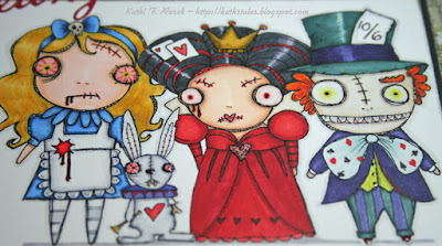
Here's my Alice in Wonderland inspired project.


I've used several Vera Lane Studio Digital Stamps, namely Alice and the White Rabbit from the Alice and the Rabbit Wonderland set, the Queen of Hearts from the Quirky Queen of Hearts set, the Mad Hatter from the Mad Hatter set.

The characters were resized, grouped in PhotoElements, reduced as a group, printed out onto Neenah cardstock with my laser printer, then colored with Copic markers. Their eyes, Alice's skull, White Rabbit's horn, nose, teeth, armbone, the Queen of Hearts' crown, and the Mad Hatter's teeth and shoes were all coated with several layers of Clear Gelly Glaze pen (Sakura) to make 'em dimensional and shiny. The blood drips were coated with a  layer of Red Gelly Glaze pen (Sakura) to add some additional ick factor. Don't you think that "The Ick Factor" would be a great name for a reality show?  The Queen's heart became a jeweled brooch due to Red Stardust Glitter pen (Sakura), Garnet Spica Glitter pen (Copic), and several layers of Clear Gelly Glaze pen (Sakura).

Here's a close-up so you can see what my beloved Clear Gelly Glaze pen does!


I should mention that I added the red capillaries to the eyes of both Alice and the White Rabbit and added pupils to the Queen and the Hatter. I added some clubs, spades, hearts, and diamonds to the Hatter's tie.
 
The patterned paper is from the Destinations Paper Stash (Tim Holtz/Idea-ology). The edges were sponged with Watering Can Archival ink (Ranger). 

Red adhesive cardstock (QuicKutz) was die-cut with the Season's Greetings die (Impression Obsession). "From" was die-cut from yellow adhesive cardstock with the A Hint of Lime font (Die-Versions). "Zombie" was die-cut from green adhesive cardstock with the Alphabet Typewriter UC die (Impression Obsession). "Wonderland" was die-cut from blue adhesive cardstock with the Eliza Mini font set (QuicKutz). Looking at the card now, I probably should have stayed with just red and blue cardstock. Oh well. It's done and done is good.

I was going to add some other stuff to the card, but I decided that more stuff would be too much stuff. "Less is more" and all that. KWIM?

Now that you've seen my project, your next stop on the hop is Karen's blog and I'm sure you'll find something totally wonderful there! If you get lost, the blog hop list is below!

Thanks for visiting today!


Blog Hop List

Friday, July 3, 2015

Red, White, and Blue!

This week's challenge at The Outlawz Coloring Challenges is to use Red, White, and Blue and/or create a patriotic project. My Outlawz Coloring Challenge teammates, Carla, Penny, Karen, Vannessa, and I challenge you to use create a project for this challenge. You can use any coloring medium you like, just as long as you color! 

Our July sponsor at The Outlawz Coloring Challenges is Sweet Pea Stamps, who is offering our lucky winner three digis of his/her choice from the Sweet Pea Digi Stamp Store.  Play along with us for your chance to win!


I vaguely remembered that I had some strawberry patterned paper and thought it was in a 6x6 pad by Basic Grey. After going through a bunch of pads, I was delighted to find that not only was I correct, I even had one piece of it left! Woo-hoo! The strawberry patterned paper is from the Nook and Cranny 6x6 pad (Basic Grey). 

Picking Strawberries was slightly reduced in PhotoElements, printed out with my laser printer onto Neenah cardstock, then colored with Copic markers to match the strawberry patterned paper. Since this was a red, white, and blue challenge, I decided to make her eyes and some of the flowers blue. Since repetition is one of of the "style rules" I like to follow, I used speckled blue patterned paper by KMA that was ancient. I also used some blue gingham patterned paper from a not-quite-as-old patterned paper by Authentique. 

One of my Fishtail Flags dies (Die-namics) was used to die-cut the gingham paper. The speckled blue patterned paper was die-cut with one of the dies from the Circles Nestabilities die set (Spellbinders). 

White cardstock was punched with a very old strawberry punch. The strawberries were colored with Copic markers, then dotted with a black pen. 

The patterned papers were edged with either Abandoned Coral or Faded Jeans Distress inks. 

Thanks for visiting today!
I shall enter this card into the following challenges.
Mod Squad Challenge Blog: Patterned Paper
The House that Stamps Built Challenges: Red, White, and Blue
Cards in Envy Challenges: Red, White, and Blue 

Thursday, July 2, 2015

Ocean Flowers

If you've visited my blog, you've no doubt noticed that I like to create underwater scenes. I love the ocean and the beach, though I don't visit either very often. Maybe that's why the underwater world holds my fascination and captures my imagination.

Here's my latest scene with SCACD's Coral Sunflowers rubber stamp set, from their new Eclectic Sea collection.


I started this wall hanging by creating a sea background by brushing Blue Green Light, Cerulean Blue, Cobalt Turquoise Hue, and Cobalt Teal Hue Media Fluid Acrylic (MFA) paints (DecoArt) onto 140 lb. Mixed Media cardstock (Strathmore). When the paint was dry, Fern Green Archival ink (Ranger) was sponged over the Kelp Forest stencil (The Crafter's Workshop) on the bottom of the piece. Rays Layering Stencil (Stampers Anonymous/Tim Holtz) was placed over the painted cardstock and Translucent White MFA paint) was sponged over the stencil, then wiped back with a baby wipe.

Both flowers from SCACD's Coral Sunflowers rubber stamp set were stamped onto white tissue paper with Jet Black StazOn ink (Tsukineko/Imagine Crafts). I marked the stamped side with a pencil before flipping the tissue paper over. I painted the reverse of the flowers using Quinacridone Burnt Orange, Diarylide Yellow, Hansa Yellow Light, Hansa Yellow Medium, and Cadmium Orange Hue MFA paints. When the paint was dry, I carefully cut around the Coral Sunflowers.

White cardstock was die-cut with Weeping Willow Branches die (Poppy Stamps),  Swimming Seahorses die (Memory Box), Build a Scene Underwater (Taylored Expressions), and the Mini Shell die set (Impression Obsession). I also used a very old unlabeled fish punch and a crab punch to punch white cardstock. The punchies and die-cuts were all colored with Copic markers.

The painted ocean and the painted side of the Coral Sunflowers were brushed with Media Matte Medium (DecoArts) and all three painted tissue-paper Coral Sunflowers were adhered to the sea background. Another layer of Media Matte Medium was brushed over top of the tissue paper images.

The coral, ocean plant, Seahorses die-cuts and the fish punchies were adhered to the ocean scene using Media Matte Medium and another layer of Media Matte Medium was applied over top of the die-cuts and punchies.

The entire piece was then adhered to chipboard, so that the piece would not buckle during the next step. Texture Sand Paste (DecoArt) was applied to the base of the piece with a palette knife. This was allowed to dry overnight.

The next day the Texture Sand Paste was dry-brushed with Titan Buff, Burnt Umber, Burnt Sienna, and Raw Sienna MFA paints. When the paint was dry, the various shell and starfish die-cuts and the crab punchies were adhered to the piece using Diamond Glaze (Judikins). The piece was finished with some clear pearls.

Thanks for visiting today!

I shall enter this piece into the following challenges:
Not Just Cards Challenges: Anything Goes
2 Creative Chicks Challenges: Anything Goes
Altered Eclectics Challenges: Anything Goes
Papertake Weekly Challenges: Take Your Pick (pearls and covering chipboard).
Scrapy Land Challenges: Anything Goes

Wednesday, July 1, 2015

Rainbow Ribbon!

Corrie Herriman is our hostess this week this week at Stampotique Designers Challenge Blog and she is challenging you to use ribbon. Here's what she has to say about her challenge!

"I struggle to use ribbon in my projects but I do like it. So I want you to show me what you do with ribbon. Have fun!"
If you'd like the chance to win your choice of $30 worth of Stampotique stamps, you should play along with this challenge. You have until the end of the month to create and share your challenge projects for this month. Visit Stampotique Designers Challenge blog and be sure to read the rules so that you'll have the chance to win that great prize!!

Recent events here in the U.S.A. prompted my project. Here's my tag with Stampotique's Froggie (Daniel Torrente).


Froggie was stamped with Tuxedo Black Memento ink (Tsukineko/Imagine crafts), colored with Copic markers, fussy-cut, and edged with a black marker. She was positioned on rainbow ribbon that was threaded through a cardstock rectangle. 

A balloon die (QuicKutz) was used to die-cut white cardstock, which was then colored with Copic markers, and attached at the top of the blue panel with dimensional foam adhesive. Rainbow ribbon was used to attach the ribbon to Froggie's hand. More ribbon was stapled to the top of the tag and the staples were covered with an ancient plastic thingie from KI Memories.

Thanks for visiting today!

I shall enter my tag into the following challenges:
Loves Rubber Stamps Challenges: Celebrations 
Artistic Inspirations Challenges: Anything Goes with a Twist of Odd 
Craft Your Passion Challenges: Anything Goes